Introduction
Hook: Imagine clicking on a website in 2025 that looks like it hasn’t aged since 2005 – think neon text, blinking banners, and a “Welcome!” animation. You’d probably cringe and close the tab faster than you can say Dial-Up Internet. We’ve all been there, landing on a site that feels like a relic with confusing navigation and jarring auto-play music. It’s not just an eyesore; it’s bad for business. In an era where sleek apps and modern sites set the bar, a dated website screams, “I stopped caring a decade ago.” Not exactly the message you want to send to potential customers.
Why It Matters: Web design isn’t just about looking pretty – it’s about credibility, usability, and cash. Your website is often the first impression customers get of your business, and 94% of those first impressions are design-related . Translation: if your site looks shoddy or outdated, visitors might not stick around long enough to discover how great your product or service is. Conversely, a polished, user-friendly site builds trust instantly (about 75% of people admit they judge a company’s credibility by its website design . Design also has a huge impact on SEO and sales. Google now uses mobile-first indexing – if your site isn’t mobile-friendly, it might not rank at all (Google won’t index sites that do not work on mobile devices after …). And slow loading? Forget it. Online shoppers in 2025 have the patience of a toddler on espresso. If your site is sluggish, visitors will bounce. In fact, 40% of users abandon a website if it takes more than 3 seconds to load (Surviving high-traffic events with Fastly | Fastly). All this to say: good web design isn’t just “nice-to-have” – it directly affects whether people find you on Google, whether they trust you, and whether they buy from you.
Key Highlights:
- Minimalist Design: The article underscores the effectiveness of clean, clutter-free layouts that enhance user focus and engagement. This aligns with industry observations that simplicity often leads to higher conversion rates.
- Mobile-First Approach: Emphasizing the necessity of designing for mobile users, the article reflects the industry’s shift towards prioritizing mobile experiences, especially with Google’s mobile-first indexing. webfx
- Site Speed: Highlighting the critical role of fast-loading websites, the article echoes the consensus that speed is vital for retaining users and improving search rankings. designmodo
- Emerging Trends: The discussion on AI-powered design, voice search optimization, and dark mode adoption aligns with current technological advancements shaping user experiences.

What Works in 2025: Foundations of Modern Design
(750+ Web Design Pictures | Download Free Images on Unsplash) Minimalist Design Example: A clean, clutter-free website layout that puts content first. Fewer distractions mean users can focus on your product or message. (MacBook Pro on table beside white iMac and Magic Mouse photo – Free Background Image on Unsplash) In 2025, simple sells. That’s why the first big “what works” is minimalist design. It turns out that less is more is more than just a mantra – it’s a money-maker. Removing clutter (no more walls of tiny text or ten different banners vying for attention) helps your key content and call-to-action shine. Think of a tidy, well-organized storefront versus one crammed floor-to-ceiling with junk; customers will gravitate to the one where they can actually find things. Online, the same rule applies. A minimalist layout with plenty of white space, large visuals, and clear navigation isn’t just aesthetically pleasing – it guides visitors toward action (like making a purchase or contacting you) without overwhelm. Studies even back this up: well-designed, simplified user interfaces can boost conversion rates by over 200% (Website user experience insights – Think with Google). In short, cutting the clutter can directly boost your bottom line.
Why Minimalism Isn’t Just a Trend—It’s a Money-Maker
Minimalism in web design isn’t a fleeting trend; it’s become the standard because it works. By focusing on only the essential elements, you make it ridiculously easy for visitors to understand what you’re offering and what you want them to do next. For example, a homepage with one impactful image, a headline, and a single “Shop Now” button can outperform a busy page with fifty links. Ever been to a website that bombards you with pop-ups, sidebars, and a rainbow of fonts? It’s like walking into a chaotic store – you’d probably walk right back out. By contrast, a minimalist site feels professional and trustworthy. It loads faster (fewer elements to load = quicker page speeds), looks great on both desktop and mobile, and directs the user’s eye to what matters most. Plus, it just feels calm and user-friendly. As a small business owner, you want visitors saying “Ah, this is easy” instead of “Ugh, where do I click?”. Minimalism delivers that clarity. And remember, clarity converts. When in doubt, simplify.
UX Design: The Secret Sauce to Keeping Visitors Hooked
You might hear the term UX tossed around by developers and designers. It stands for “user experience,” but let’s put it in plain English: UX is about making your website easy and enjoyable for people to use. It’s the secret sauce that keeps visitors hanging around. Good UX design means intuitive navigation, logical layouts, and content that actually meets user needs. Imagine you’re visiting your own site for the first time – can you find your Contact Us page or product pricing in a couple of seconds? If not, your UX may need work. Users in 2025 have zero patience for websites that feel like a maze. They expect to know how to get what they want without a tutorial. A well-thought-out UX is like having a friendly store guide directing customers to the aisle they need. On the flip side, poor UX is like a confusing supermarket with no signs – people will give up and shop elsewhere. In fact, 88% of online consumers are less likely to return to a site after a bad experience (Website user experience insights – Think with Google).
So, what counts as great UX in 2025? It’s a combination of clarity, consistency, and responsiveness. Navigation menus should be simple and descriptive (no weird jargon or “mystery meat” buttons – just call pages what they are, like “About,” “Services,” “Shop”). Important info should be front and center. If you have an e-commerce site, for example, make the “Add to Cart” button obvious and the checkout process smooth. If users have to dig for basic info like your business hours or shipping rates, that’s a UX fail. Also, consistency is key: use the same design patterns and terminology throughout your site so people don’t get confused. Lastly, test the experience. Click through your site as if you’re a customer. Better yet, have someone not involved with your business do it and watch where they stumble. Pro tip: a five-second test can work wonders – show someone your webpage for five seconds, then ask what they remember or where they’d click next. If they’re clueless, your design might need a tweak. Good UX design makes visitors feel smart and in control – and when they feel that way, they stick around longer and engage more.

Mobile-First = Google-First: How to Ace Responsive Design
By now, “mobile-first design” isn’t just a buzzword – it’s the reality of web design in 2025. Mobile devices generate about 60-65% of web traffic these days (What Percent of Web Traffic is Mobile? – Marketers List), so if your site doesn’t work well on a phone, it’s like turning away half (or more) of your potential customers at the door. Mobile-first design means you intentionally design your website starting with the mobile experience, then scale it up for larger screens. This approach ensures that the most important elements are accessible and user-friendly on the smallest display. In practical terms: text should be readable without zooming, buttons should be thumb-friendly (no tiny links that require needle-point precision), and images should resize to fit nicely on a portrait screen.
Why is mobile-first so critical? For one, Google’s entire search index is now mobile-first, meaning Google predominantly uses the mobile version of your site for indexing and ranking (Google won’t index sites that do not work on mobile devices after …). If your mobile site is an afterthought or (gasp) non-existent, your SEO will suffer big time. Google essentially penalizes sites that ignore mobile users by ranking them lower. And even aside from Google, think about your users: how often do you pull out your phone to look something up? Likely all the time – your customers do too. They might discover your site through a Google search on mobile or click a link from social media while on their phone. A mobile-friendly (aka responsive) design adapts to any screen size, whether it’s a 6-inch smartphone or a 24-inch desktop monitor. There’s no pinching and zooming, no broken layouts – just a smooth experience throughout.
To ace responsive design, start by testing your site on multiple devices. Open it on your phone, tablet, laptop – does it look and work great everywhere? Use Google’s free Mobile-Friendly Test tool or just shrink your desktop browser window to see how your layout adjusts. Ensure your menus collapse nicely into a “hamburger” icon on mobile, and that essential info (like your logo, tagline, and maybe a call-to-action button) shows up without excessive scrolling. Remember, mobile users are often on the go – they want info fast. That means concise content and fast load times (more on site speed in a moment). If all this sounds overwhelming, don’t worry. Modern website builders and templates are usually responsive out of the box, and a good developer or web design service (shameless plug: check out our mobile-first design approach) will ensure your site looks stunning and functions flawlessly on every device. Bottom line: Mobile-first = Google-first, and it equals user-first too. Prioritizing mobile design now will save you headaches and yield happier customers (and higher search rankings) in the long run.
Useful tools to nail modern web design: In 2025 there are plenty of tools – many of them budget-friendly or even free – that can help you implement these “what works” practices:
- Figma – A powerful prototyping and collaboration tool that allows teams to design, share, and iterate on website layouts before development. Ideal for UX/UI planning and ensuring a seamless user experience.
- Canva – A beginner-friendly graphic design platform for creating professional banners, social media graphics, and website visuals – no design skills required.
- Google Fonts – A free library of web-friendly fonts optimized for readability. Choosing simple, legible typography improves user experience and page speed.
- Unsplash & Pexels – Royalty-free stock photo libraries with high-quality images to enhance your website’s visual appeal. Great for minimalist, professional designs.
- Google PageSpeed Insights – A crucial speed-testing tool that analyzes your website’s performance, flags slow-loading elements, and suggests improvements for better SEO and user retention.
- Responsive Design Checker – A tool that previews how your website looks on different devices, ensuring it’s optimized for mobile, tablet, and desktop users.
These tools can make a small business owner’s life easier, whether you’re DIY-ing your website or collaborating with a designer. They help ensure your design stays simple, user-centric, and responsive – all the ingredients for a successful 2025 web presence.
What Doesn’t Work: Costly Mistakes to Avoid
We’ve covered the good – now let’s talk about the bad and the ugly of web design in 2025. Technology and tastes evolve fast, and some design practices that might have been okay in the past can now send visitors running (or Google’s bots frowning). Let’s break down a few costly mistakes you’ll want to steer clear of, from glacial load times to navigational black holes and annoying gimmicks.
Why Your Slow Website Is Driving Customers to Competitors
(Frustrated Photos, Download The BEST Free Frustrated Stock Photos & HD Images) Frustrated user on mobile: If your site loads at a snail’s pace or freezes up, this is how your potential customers feel – and many won’t stick around. (Man in Pink Dress Shirt · Free Stock Photo) When it comes to websites, speed kills – or rather, the lack of speed kills conversions. Today’s users expect sites to load yesterday. If they click your link and nothing happens for a few seconds, their thought process goes something like: “Hmm, maybe it’s broken… I’ll try another site.” And poof – they’re gone to your competitor. We’re not exaggerating: 40% of users abandon a website that takes more than 3 seconds to load (Surviving high-traffic events with Fastly | Fastly) (and that stat climbs higher for each additional second). On mobile, people are even less patient, with up to 53% bouncing after 3 seconds of wait (Surviving high-traffic events with Fastly | Fastly). A slow site is essentially leaking potential customers.
So what causes slow speeds? Often it’s huge images or videos, too many fancy animations or plugins, or cheap hosting. The good news: you can fix most of these. Compress your images (your site can still look gorgeous without 5MB image files), eliminate unnecessary scripts or bloat (that chat widget from 2010 that nobody uses – maybe toss it), and consider using modern tech like lazy-loading (loading images as the user scrolls, not all at once). Also, choose a decent hosting provider; it’s literally the foundation of your site’s performance. Remember, your website’s speed is like a silent salesperson. If it’s quick and efficient, customers stay happy; if it’s slow, customers leave before you even get to make your pitch.
To put it in perspective, here’s a quick “Fast vs Slow” comparison that highlights why speed matters:
| Page Load Time | User Reaction | Business Impact |
|---|---|---|
| Fast (≈2 seconds) | Users stay engaged (minimal bounce) – “Nice, I’m in instantly!” | More pages viewed, higher chance of conversion (sales, sign-ups, etc.) |
| Slow (≥5 seconds) | Users get impatient and often leave – “Ugh, this is taking forever…” | Lost traffic and sales (visitors jump to competitors); negative SEO impact (Google ranks slow sites lower) |
In short, a slow website is driving customers to your competitors. It’s like having a shop where the door is half-stuck – people jiggle the handle, get frustrated, and walk away to the shop next door. Don’t give them a reason to leave. Optimize your site for speed: compress images, enable browser caching, use a Content Delivery Network (CDN) if possible, and test regularly. Pro tip: use tools like Google PageSpeed or GTmetrix – they’ll tell you exactly what’s slowing your site down. A little tuning can make a big difference. In the land of web design, faster is always better.
Navigation Fails: How Confusing Menus Kill Conversions
Have you ever been on a website and felt completely lost, like someone dropped you in a maze with no exit signs? That’s what confusing navigation does to your visitors. In 2025, users expect clear, intuitive navigation. If your menu items are all over the place, or labeled with clever but unclear names (“Our Solutions” – what does that even mean? Solutions to what?), you’re setting a trap for your own users. And if they can’t find what they’re looking for quickly, they’ll bounce. It doesn’t matter if you have the best product in the world – if a visitor gets frustrated trying to locate it on your site, you’ve lost the sale.
Common navigation mistakes include: too many menu items (the “kitchen sink” menu that throws every page at the user – overwhelming!), or too few (hiding important pages so deeply that only a detective could find them). Another fail is using non-standard labels or icons without explanation. While you might think it’s artsy to have a cryptic menu, users aren’t playing a guessing game. They’ll simply leave. Consistency is also key: if your homepage menu has five options, but on your About page the menu changes or things move around, that inconsistency confuses people. Keep your navigation structure uniform site-wide.
To avoid these pitfalls, follow a few best practices. Stick with familiar terms for menu items – e.g., “Home,” “About Us,” “Services,” “Contact.” This isn’t the place to reinvent the wheel. Use dropdowns sparingly; if you have a lot of content, group sub-pages under logical headings, but don’t go wild with multi-tier mega menus unless absolutely necessary (and if you do, test them on mobile for usability). Make sure your logo (usually top-left) links back to the homepage – users expect that. And include a search bar if your site has a ton of content or products; many users will head straight to search if they can’t immediately spot what they need.
Finally, think about the user journey. For a small business site, a common journey might be: visitor lands on Home page, learns about your offerings (Services page), checks your credibility (About or Testimonials), then wants to get in touch (Contact). Your navigation should make that journey obvious. If one of those steps is hard to find, that’s a navigation fail. It’s like having a store where the aisles aren’t labeled – customers wander around frustrated. Guide them clearly, and you’ll lead them right to checkout (or whatever your conversion goal may be).
The Pop-Up Paradox: When Annoying Ads Backfire
Pop-ups: love them or hate them, they’re everywhere. And truth be told, they can be effective for things like building an email list or announcing a sale. But there’s a paradox – use them wrong, and they do more harm than good. The mistake many small businesses make is slapping too many pop-ups or timing them poorly, to the point of annoying the user. Ever visited a site and within one second you get a pop-up asking you to subscribe, then another offering 10% off, and maybe a chat box jumping in, all before you’ve even seen the actual content? It’s a pop-up ambush, and it will drive people away.
Google actually penalizes sites for overly intrusive pop-ups on mobile (they call them “intrusive interstitials”). So aside from annoying humans, obnoxious pop-ups can hurt your SEO. The key is to use pop-ups judiciously if at all. One well-timed, relevant pop-up can convert (say, an exit-intent pop-up that offers a last-minute discount before someone leaves, or a newsletter sign-up that appears after a user has been on the site for a minute). But multiple pop-ups, or those that cover the whole screen and are hard to dismiss (where’s the darn “X”?!), will backfire. Users will just close the entire tab out of frustration.
Consider the user’s intent. If someone came to read your blog post, let them at least read a bit before you interrupt. If they’re shopping, maybe wait until they’ve viewed a couple of products or added something to cart before nudging them with a sign-up offer. And always provide a clear, easy way to close the pop-up. Nothing infuriates visitors more than a pop-up that feels like a clingy salesman who won’t take “no” for an answer. Less is more here – one pop-up per visit, max. In fact, many modern, well-designed sites in 2025 have moved away from traditional pop-ups in favor of less intrusive banners or slide-ins that don’t completely disrupt the experience.
Personal anecdote: I once landed on a site that hit me with three pop-ups in a row – I literally spent my first 10 seconds closing things. I got so annoyed that I bailed without even looking at the content. That business not only lost a reader, they probably lost a customer. The paradox is that while pop-ups aim to engage users or capture info, when overused, they achieve the opposite – they repel. So, use them wisely or consider alternatives like an inline sign-up form at the end of a blog post or a small header banner for your promo. Remember, a happy user is more likely to convert than an irritated one. Don’t let pop-up greed sabotage your user experience.
What’s Next: Trends Shaping the Future
Web design never stands still. Just when you think you’ve got the latest and greatest site, a new trend or technology comes along and flips the script. So, what’s on the horizon as we move further into the mid-2020s? Here are a few big trends and buzzwords shaking things up – and what they mean for you as a small business owner.
AI in Web Design: Will Robots Replace Designers? (Spoiler: No)
By now, you’ve probably heard the hype about artificial intelligence doing everything from writing code to creating logos. In web design, AI is making its mark with tools that can generate website layouts or even entire site designs based on preferences. There are AI web design tools that promise to build you a decent-looking website with minimal human input. So, should your trusty web designer start job hunting because the robots are coming? Spoiler: No. While AI is a powerful helper, it’s not replacing human web designers – at least not if you care about having a truly custom, brand-fitting site.
What AI can do is handle some grunt work and offer suggestions. For instance, platforms like Wix ADI or certain WordPress plugins use AI to assemble a basic site for you after you answer a few questions. They’re nifty for a quick start. There are also AI tools that can generate color palettes, suggest design improvements, or even write content. (Hello, ChatGPT for content ideation – a great tool when you’re stuck staring at a blank page!). In fact, many designers now use AI-assisted design tools to speed up their workflow or to get inspiration. These tools might auto-generate multiple layout variations that a human can then refine. It’s like having an intern who works at superhuman speed – you still give the final approval and direction.
The limitation is that AI lacks the creative intuition and business insight a human brings. An AI might not grasp the subtle emotional appeal your brand needs to convey, or the unique problem your business solves for customers. It can’t have a strategic brainstorming session about how to stand out from competitors. AI designs also risk feeling a bit cookie-cutter because they’re based on patterns learned from existing websites. A human designer, on the other hand, can intentionally break patterns, make a bold creative choice, or tailor the experience to the story you want to tell.
So, the future is AI + human, not AI versus human. Small businesses can benefit from AI by using it as a tool: generate content drafts, get layout ideas, or quickly mock up a page – then have a human (either you, if you have an eye for design, or a pro) polish it up. Think of AI as your design sidekick. It can crunch data and do the heavy lifting, but you (or your designer) provide the heart and strategy. Rest assured, the robots aren’t putting creatives out of work; if anything, they’re taking the drudge work off our plates so we can focus on the creative decisions that really matter.
Voice Search: Why Your Website Needs to ‘Talk’ to Users
“Hey Google, find me the best pizza in town.” “Alexa, how late is [Your Business] open today?” – This is how people are interacting with search now. Voice search isn’t just a sci-fi concept; it’s mainstream. With smart speakers in homes, voice assistants on phones, and even voice search in cars, more and more users are literally asking for information instead of typing. By the end of 2025, experts estimate there will be 8.4 billion voice assistants in use worldwide (yup, more voice assistants than people on the planet!) (The Rise of Voice Search: What It Means for SEO in 2025 – SEOmator). So what does that mean for your website?
Firstly, you’ll want to make sure your content is optimized for voice queries. Voice searches tend to be more conversational and question-based. For example, a typed search might be “weather Dublin today”, whereas a voice search might be “What’s the weather like in Dublin today?” This means incorporating natural language and question-and-answer formats into your site content can help. A great place to do this is an FAQ section (notice something? We practice what we preach). When you answer common questions on your site – using full questions as headings and clear answers – you increase the chances of showing up as a result for those voice queries. Structuring content with schema (a type of code that helps search engines understand your content) can also improve your odds of being the answer voice assistants read out.
Another angle is considering voice interaction on your site itself. We’re not fully there yet for every small business, but big players have started integrating voice UI on websites (for accessibility and convenience – e.g., allowing a user to search a site or fill a form by voice command). It might not be a must-have for you right now, but keep an eye on it. If you run, say, an e-commerce store, imagine a user eventually being able to say, “Show me red running shoes in size 9” and your site brings up the products. This level of interface might become commonplace sooner than we think.
At the very least, think about how your site content sounds. Read it out loud. Does it sound like a human conversation? If someone asked their Echo or Siri about your business (“…what does [Your Business] offer?” or “…where is [Your Business] located?”), will the answer (pulled from your site or Google listing) make sense and entice them? Voice search is pushing us towards more natural content and concise answers. Embrace that by writing in a conversational tone (which you’re already doing if you’ve read this far!), and by structuring info clearly. This way, whether a potential customer is looking at a screen or listening through a device, your website is ready to talk to them.
Dark Mode & 3D Elements: The New Aesthetic Standards
On the design trend front, two things are making waves: dark mode designs and subtle 3D elements in web interfaces. They’re part of the modern aesthetic in 2025 that you’ve likely seen creeping into apps and sites.
Dark mode – you’ve probably seen this option in your phone settings or in apps like Instagram or Twitter, where the background turns black or dark gray with light text. Users love dark mode for a variety of reasons: it can be easier on the eyes at night, it gives a slick, modern vibe, and frankly, it looks cool. Many websites are now offering a dark mode toggle, allowing visitors to switch to their preference. Even if you don’t provide a toggle, designing your site to still look good if the user’s device forces dark mode is a consideration. (Some browsers and OS settings attempt to auto-convert sites to dark mode – having a design that’s adaptable ensures it doesn’t turn into a horror show of inverted colors.) Dark palettes, when done right, can make colors and images pop and can convey a mood of luxury or tech-savvy professionalism. That said, dark mode isn’t right for every brand – for instance, a children’s toy store might stick to bright, cheerful colors. But if your brand could suit a darker theme (say, you’re a trendy tech startup, a gaming shop, or a cocktail bar), it’s worth exploring. At minimum, ensure your branding and logo don’t look weird on dark backgrounds (some email clients use dark mode, etc., and you don’t want a logo with a white background box showing up awkwardly).
Next, 3D elements. We’re not talking about those old-school 3D glasses, nor full-on virtual reality (that’s another topic!). This is about adding depth and dimension to web visuals. Flat design (which has been popular for many years) is evolving to reintroduce some depth in a subtle way. You might notice more use of shadows, layered elements that overlap, or graphics that look like they’re in a three-dimensional space. Even 3D illustrations and animations are becoming more common, thanks to better technology and faster internet speeds. For example, instead of a flat icon of a product, a site might show a 3D model that the user can rotate. Or a homepage might feature a playful 3D graphic that moves slightly as you scroll, creating the illusion of depth. These touches can make a site feel next-gen and engaging.
However, a caution: don’t go overboard. The focus should still be on usability. 3D elements should enhance the user experience, not distract or slow it down. The same goes for any fancy visual trend. It’s easy to get caught up in “cool design tricks,” but always ask – does this help my user? For example, a subtle 3D hover effect on a product image (so it pops out a bit) can provide a nice feedback to the user. But a gratuitous 3D spinning logo… probably not helping anyone. As we move forward, expect these visual trends to continue blending with practical design. A well-placed shadow here, a dark mode option there, a touch of animation – they all contribute to that polished, up-to-date feel that tells visitors your site is keeping up with the times.
In summary, the future of web design is all about combining technology (like AI and voice) with human-centric design (personalization, accessibility), and keeping the visuals fresh (dark mode, 3D, whatever comes next) without losing sight of function. Stay curious and don’t be afraid to adapt some of these trends for your own website. The businesses that thrive online are often the ones that strike the right balance between innovation and intuition – trying new design ideas while always keeping the user’s needs front and center.
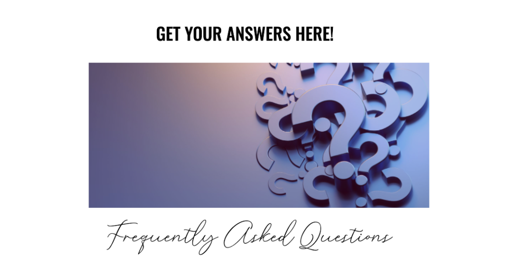
FAQ
(Got questions? We’ve got answers! Here are some common questions small business owners have about web design, answered in a no-nonsense way.)
- How often should I update my website’s design?
- Aim for a refresh every 2-3 years. Tech evolves fast — don’t let your site become a relic! If your site still has Flash intros or looks like it was built when MySpace was a thing, it’s definitely time for an update. Regular smaller tweaks are good too, but a major design overhaul every few years keeps your business looking modern and credible.
- Can I design a website myself without coding skills?
- Absolutely! Platforms like Squarespace, Wix, or WordPress with pre-made themes make it drag-and-drop easy to build a decent site with zero coding. They offer beautiful templates that are mobile-friendly out of the box. For a simple brochure site or a personal blog, DIY is fine. But if you need advanced features, custom functions, or serious SEO optimization, you might eventually want to hire a pro. Think of it like cooking: you can whip up dinner from a kit, but for a gourmet meal (or if something complex goes wrong), a chef’s expertise helps.
- What’s the #1 mistake small businesses make in web design?
- Prioritizing looks over performance. A gorgeous site that loads like a snail is like a sports car with no engine – all show, no go. It’s tempting to add all the bells and whistles (videos, high-res images, fancy scripts), but if they slow down your site, you’ll lose visitors. It’s better to have a fast, slightly simpler design than a stunning slowpoke. Speed, clarity, and mobile-friendliness should never be sacrificed for just “prettiness.” Ideally, you get both! But performance is the foundation.
- Is a custom design really necessary, or can I just use a template?
- In many cases, a high-quality template will do the job, especially if you’re just starting out or on a tight budget. Templates today are pretty darn good and customizable. Using one can save you time and money. However, a custom design can give you a unique brand identity and tailor the experience exactly how you want. It’s like the difference between a off-the-rack suit and a tailored suit – the off-the-rack is cheaper and can look nice, but the tailored one fits perfectly. If you have specific needs or you want to stand out from a sea of similar-looking sites, a custom design is worth the investment. Many businesses start with a template and go custom as they grow.
- How can I make my website load faster?
- Start with optimizing images (compress them so they’re smaller in file size but still look good – tools like TinyPNG help). Remove or disable any unnecessary plugins or scripts, as each one can add load time. Use browser caching and enable gzip compression (if this sounds techy, your web person or host can help – it basically makes your files smaller for transfer). Choose a good web host; sometimes a slow site is simply due to a sluggish server. Also, minimize redirects and avoid auto-playing videos or music. In short, streamline your site. There are free tests (Google PageSpeed Insights, GTmetrix) that will give you specific recommendations. Tackle as many as you can – each millisecond counts in keeping visitors engaged.
- Any quick SEO tips to help my website rank better?
- For starters: mobile-first design (Google indexes mobile versions, so ensure your site is mobile-friendly), fast loading speeds (we’ve hammered this home, and Google agrees), and relevant content. Use keywords naturally in your page titles, headings, and text – think about what your customers would search for. For example, if you’re a bakery in Dublin, phrases like “best cupcakes in Dublin” should probably appear on your site (if they are true!). Make sure each page has a unique title tag and meta description – that’s what shows up in Google results. And don’t forget the basics: submit your site to Google Search Console, get listed on Google My Business for local SEO, and consider creating content (like a blog) to target long-tail keywords. For more in-depth strategies, check out our SEO tips – we live and breathe this stuff and have a whole team dedicated to boosting rankings.
- What are common eCommerce website mistakes to avoid?
- When running an online store, some pitfalls can really hurt sales. One big mistake is having a complicated checkout process – if buying something feels like doing taxes, people will abandon their carts. Keep it as few steps as possible (and offer guest checkout without forcing account creation). Another is using low-quality images or lacking product details; online shoppers can’t hold the product, so high-res photos (that still load fast) and thorough descriptions are crucial. Also, neglecting site search or filtering is a mistake – if you have lots of products, help users find what they want quickly. And of course, all the general mistakes we discussed apply too: slow load times (a killer for eCommerce, where each second delay can significantly drop conversion rates), not being mobile-friendly (many shoppers buy via phone), and poor navigation. Lastly, don’t hide costs – surprise fees at checkout (like shipping) are a major cause of cart abandonment. Be transparent and user-centric, and you’ll avoid most eCommerce website mistakes that plague others.
- What’s the difference between UX and UI?
- Great question! These two acronyms get thrown around a lot. UI stands for User Interface, which basically means the visual elements of a site – the layout, buttons, typography, colors, etc. It’s what the user sees and clicks/taps on. UX stands for User Experience, which is broader – it’s how a user feels when using the site, and how easy and pleasant it is for them to accomplish their goals. Think of UI as the tools and UX as the result. For example, on a contact form, the UI is the design of the form fields and submit button; the UX is whether the form is easy to find, straightforward to fill out, and gives a helpful confirmation after submission. Good UI contributes to good UX. You can have a pretty interface (UI) but if it’s confusing to navigate (bad UX), users will be unhappy. Conversely, even if your site structure is logical (good UX), if the visuals are ugly or inconsistent (bad UI), users might not trust it. In a nutshell: UI is the look, UX is the feel. Both need to work together for a successful website.
- Should I worry about website accessibility?
- Yes, indeed! Accessibility means making sure everyone, including people with disabilities, can use your website. This includes users who may be blind (and use screen readers), deaf, or have motor impairments, among others. Not only is it the right thing to do (you want to welcome all potential customers, right?), but it can also be legally required in many places to avoid discrimination. Practical steps: add alt text to images (so screen readers can describe them to visually impaired users), ensure your text contrast is high (so it’s readable for those with low vision or color blindness – e.g., no light gray text on white, please), and make sure the site can be navigated via keyboard (some can’t use a mouse). Also, avoid using only color to indicate something important (like “press the red button” – some users can’t distinguish red/green). Many modern site themes are built with accessibility in mind, but you might need to do a little extra here and there. The bonus is that a lot of accessibility best practices (like descriptive alt text and clear headings) also improve SEO and overall UX. So it’s a win-win. An accessible site ensures you’re not inadvertently turning away any visitors who want to do business with you.
- What’s one web design trend I should not jump on blindly?
- Beware of doing something just because it’s “trendy.” A good example is the one-page website craze or overly artistic layouts that look like a design portfolio but confuse users. One-page sites (where all content is on a single long scroll) can work for simple narratives, but they’re terrible for SEO if you have multiple distinct topics, and can be a pain to navigate if not done carefully. Similarly, auto-playing background videos or crazy cursor effects might look cutting-edge, but if they distract from your content or slow your site, they hurt more than help. In 2025, we see some sites going wild with creativity – which is awesome when it matches the brand and audience (like a hip design agency showing off). But for a small business, clarity and function trump fad. By all means, be modern and stylish, but always ask: does this element/feature serve my visitor? If not, think twice. It’s better to be slightly conservative and user-friendly than to implement a hot new trend that leaves your users scratching their heads. In short, don’t chase trends at the expense of usability or your brand’s voice.
Hopefully, these FAQs clear up some of your burning questions. Remember, web design is an ongoing learning process even for the pros, so keep asking questions and updating your knowledge. Your website is a living part of your business – nurture it, and it will serve you well!
Conclusion
Your website isn’t just an “online brochure” – it’s often the heart of your business’s online presence, the first greeting handshake to a potential client. By now, we’ve seen that what works in 2025 is a mix of timeless principles (simplicity, speed, user-centric design) and modern must-haves (mobile-first, AI-assisted features, voice readiness). And we’ve exposed what doesn’t work – the pitfalls that are best left in the past (so long, slow sites and obnoxious pop-ups ). As for what’s next, the horizon is exciting with AI and new design trends, but it all circles back to one thing: creating a great experience for your visitors.
The big takeaway? Web design is never “done.” It’s an evolving process. But the good news is you don’t have to overhaul your site every month to keep it effective. By focusing on the core principles outlined here, you’ll already be ahead of many competitors. Regularly audit your site – load it up on your phone on a 3G connection, have a friend navigate it, ask a new customer how their experience was. These small check-ins will help you catch issues and keep improving.
And you’re not alone in this journey. Whether you’re a DIY enthusiast or someone who’d rather call in an expert, the resources and help available to small businesses today are immense. From intuitive design platforms to professional services, there’s always a way to level up your web presence.
Ready to ditch the 2005 vibes? Let’s create a website that turns visitors into fans. Get Started.